The 2026 Guide to Conversion Design
Master conversion design with proven strategies for 2026. Discover actionable steps, expert insights, and future trends to transform your website’s results.

Master conversion design with proven strategies for 2026. Discover actionable steps, expert insights, and future trends to transform your website’s results.
In 2026, mastering conversion design is essential for businesses aiming to achieve measurable growth. Many organizations invest heavily in visually stunning websites, only to discover they do not convert visitors into customers. If you are frustrated by underperforming pages, you are not alone.
The right approach to conversion design grounded in data, psychology, and proven tactics can dramatically increase your results. This guide provides actionable strategies to help you transform your digital presence. We will cover the core principles, optimization steps,
leading tools, and future trends that will set you apart in a crowded digital landscape.
Conversion design is more than a modern buzzword. It represents the powerful intersection of user experience (UX), user interface (UI), and psychological triggers, all working together to drive users toward meaningful action.
While traditional web design often focuses on aesthetics making things look "pretty" conversion design focuses on performance. It is the discipline of crafting digital experiences that turn visitors into leads and customers. It balances visual appeal with usability, but its true strength lies in its data-driven approach.
By leveraging analytics, behavioral insights, and AI, conversion design evolves with user expectations. As noted in recent research on Multi-Attribution Learning, modern data frameworks can now predict conversion outcomes with high accuracy, allowing designers to make decisions based on math rather than gut feeling.
To achieve consistent ROI, effective conversion design follows seven foundational principles. Whether you are building a landing page or a full e-commerce site, these rules apply:
Principle | Description & Action |
Focus | Eliminate distractions. Maintain a 1:1 attention ratio where there is only one possible action per screen. |
Structure | Guide users through a logical path. Use hierarchical layouts to lead the eye from headline to CTA. |
Consistency | Maintain uniform visuals and messaging. If an ad promises "X," the landing page must immediately show "X." |
Benefits | Clearly communicate value. Don't just list features; explain how the user's life improves. |
Attention | Use color, contrast, and typography to draw eyes specifically to Calls to Action (CTAs). |
Trust | Showcase testimonials, badges, and social proof to lower anxiety. |
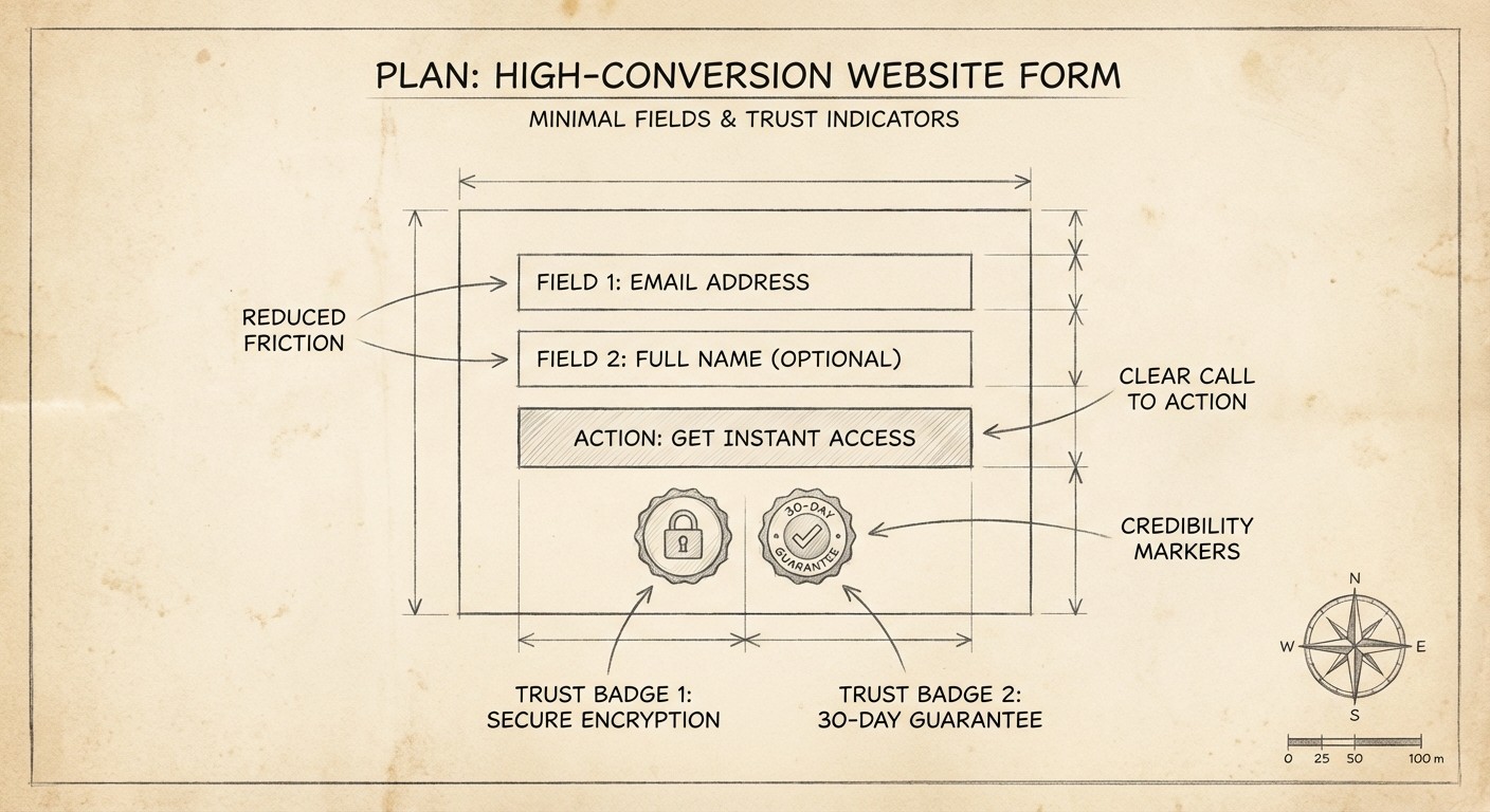
Friction Reduction | Simplify forms and reduce barriers. Every extra click costs you conversions. |
Unlocking the full potential of conversion design requires a clear, systematic process. By following these proven steps, you ensure every element of your website is purpose-built to drive action.
The foundation of effective conversion design begins with focus. Define the primary action you want users to take, such as signing up, purchasing, or downloading a resource. Avoid "choice paralysis" by asking for too many things at once. If you want them to buy, don't ask them to also follow you on Twitter.
Visualize the user journey from entry to conversion. Use tools like SmartLook or Hotjar to observe real user interactions. Identify where visitors hesitate or "rage click." If a form is too long or a button is hard to find, these are friction points you must eliminate.
Structure is the backbone of conversion design. Organize content using the AIDA framework, Awareness, Interest, Desire, Action.
Awareness: The headline catches their eye.
Interest: The subheadline explains the solution.
Desire: Bullet points explain the benefits.
Action: The button allows them to get it.
Harnessing psychology is a core pillar of modern conversion design. Urgency (e.g., "Offer expires in 2 hours") prompts quick decisions. Social Proof (e.g., "Trusted by 500+ companies") builds credibility. People naturally follow the crowd; show them that others have already said "yes."
With the majority of web traffic now coming from mobile devices, responsive design is non-negotiable. Ensure buttons are "thumb-friendly" and text is legible without zooming. Furthermore, accessibility improvements (like high contrast modes) broaden your audience and often improve SEO rankings.
No conversion design is ever truly finished. Implement A/B testing to compare different headlines, button colors, or layout variants. Data always beats assumptions.
Unlocking the true potential of conversion design requires more than attractive visuals. Here are specific, tactical changes you can make today.
The attention ratio is the ratio of interactive elements (links) on a page to the number of conversion goals (usually one). On a standard homepage, this ratio might be 40:1 (navigation, footer links, social icons vs. one "Sign Up" button). In conversion design, specifically for landing pages, you want a 1:1 ratio. Remove the navigation bar. Remove the footer links. Give the user only two choices: convert or leave.
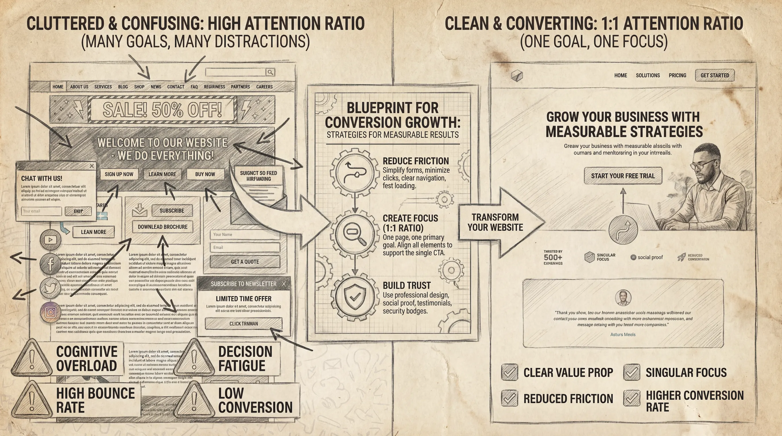
Visual hierarchy ensures users notice what matters first. A great way to test this is the "Squint Test." Step back from your screen and squint until the text blurs. Does the Call to Action (CTA) button still stand out? If it disappears into the background, you need more contrast. Use "containers" or cards to group important elements, making them pop against the background.
Your color palette should do more than look good; it should direct behavior. Use a specific "action color" that is used only for interactive elements like buttons and links. If your brand is blue and white, use a bright orange or yellow for your buttons. This contrast naturally draws the eye.
Every field you add to a form reduces your conversion rate. Ask yourself: do you really need their phone number right now? Or their company size? If not, delete the field.
Use inline validation (green checkmarks) to encourage users as they type.
Use "microcopy" near the button to reduce anxiety, such as "No credit card required" or "Unsubscribe anytime."
Selecting the right tools is vital for achieving consistent results.
Analytics: Google Analytics 4 and Mixpanel for traffic analysis.
Behavioral Tracking: SmartLook and FullStory for heatmaps and session recordings.
A/B Testing: VWO, Unbounce, and Zoho Pagesense.
Design Implementation: Framer is currently the leader for designers who want to ship high-fidelity, high-performance sites without relying on developers.
For deeper research on usability standards, we recommend the Baymard Institute, which offers extensive research on e-commerce UX performance.
The world of conversion design is evolving. Here is what is coming next.
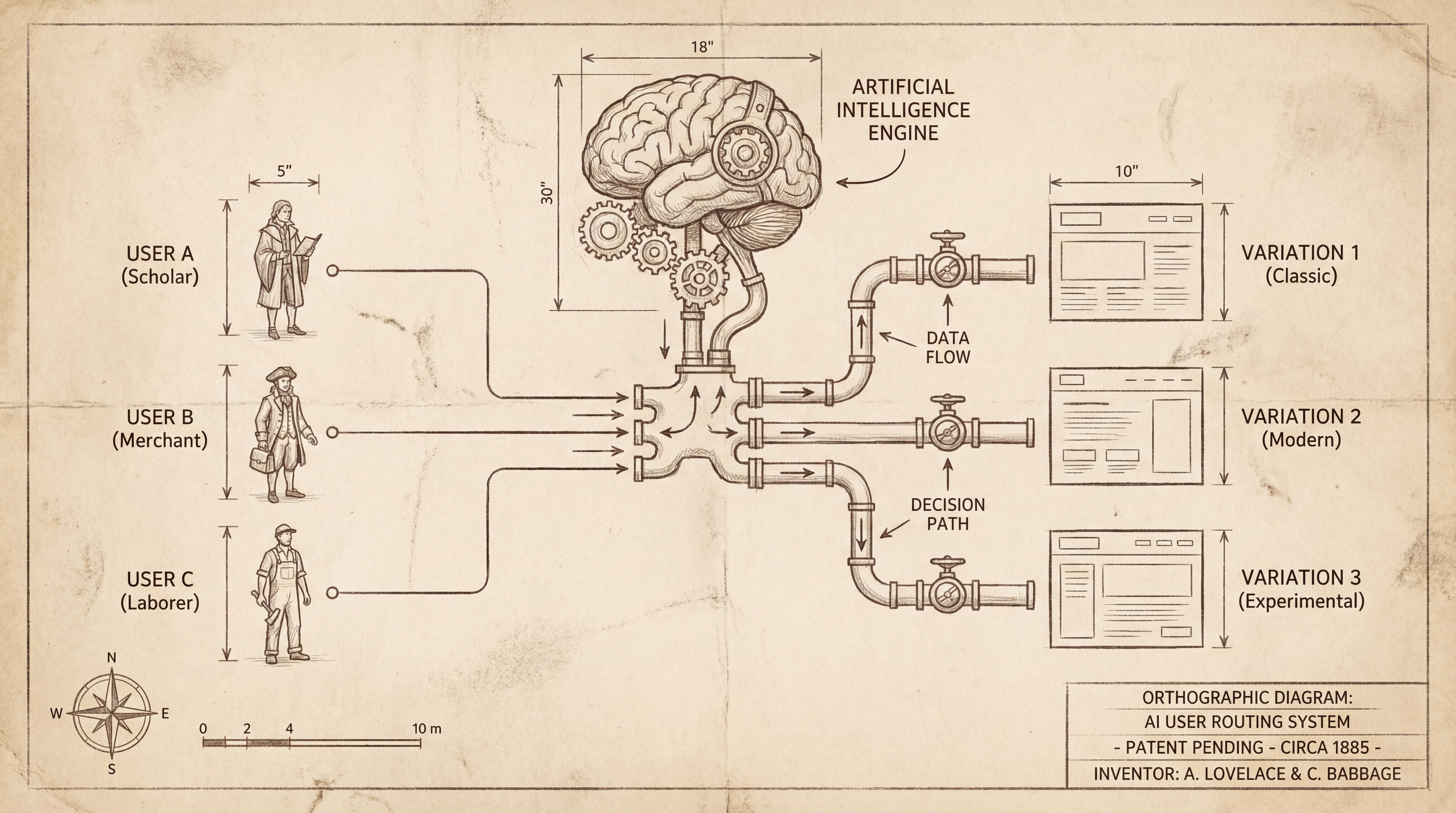
AI is revolutionizing conversion design by making experiences hyper-personalized. Tools can now dynamically change the headline or hero image based on where the visitor came from. If they clicked an ad about "Speed," the landing page emphasizes speed. If they clicked an ad about "Price," the page emphasizes value. See Personalized Marketing Offer Generation Using AI for technical insights.
New tools don't just A/B test; they route traffic intelligently. "Smart Traffic" algorithms analyze a visitor's device, location, and browser to send them to the version of the page most likely to convert them specifically.
No-code platforms are democratizing conversion design. Marketers and founders can now build high-converting sites without heavy development resources. This allows for rapid iteration—a key requirement for CRO success.
If you are a startup looking to move fast, JustFramer specializes in designing and building high-converting websites. We don't just make things look good; we build them to perform.
Why choose JustFramer?
Conversion-First Approach: Every pixel serves a business goal.
Speed: We utilize Framer to launch sites in days, not months.
Optimization: We include on-page SEO and performance optimization in every build.
Ready to see how a conversion-focused design can change your business trajectory?
[Internal Link Placeholder: Contact our team today for a free strategy consultation.
If you want to see examples of high-converting pages we have built for other startups, check out our portfolio. See our work
Get your high converting website that helps you acquire more customers.